LES DESSIN S'ENGAGE
La collection de l'artothèque en dialogue avec
LOOK&LISTEN / Schema Project NY / Atelier Tchikebe
======================
Armelle De Sainte Marie, Audrey Stone, Brent Hallard, Catherine Haggarty, Claire Colin-Collin, Claude Viallat, Didier Petit, David Ambrose, Enrico Gomez, Ernest Pignon-Ernest, François Morellet, Gabriele Herzog, Gary Peterson, Izabela Kowalczyk, Jeremie Delhome, Joris Brantuas, Jeremy Laffon, Ken Gray, Ky Anderson, Laura Charlton, Lawrence Swan, Mary Judge, Matt Kleberg, Meg Lipke, Nelio, Paula Overby, Philippe Chitarrini, Rieko Koga, Richard Van Der Aa, Rob de Oude, Robert Otto Epstein, Oriane Stender, Shawn Stipling, Tilman, Ward Schumaker, Yifat Gat.
Opening 26.4.2016 @ Artothèque, Miramas.
Drawing as a form of commited engagement, politicly as visually.
Co-Curated with Beatrice Bea.
Expo till 28.5.2016
GABRIELE HERZOG - ARTIST IN RESIDENCE
Have a look at Gabriela's INSTALL VIEW & AVAILABLE WORKS from her residence.
One of my favorite things is talking to painters about what we do. I dont mean the big fancy words, i mean down to earth, clear, simple 'shop talk'. here's another round :
CONVERSATION
Yifat Gat - Gabriele Herzog / photos by Julia Gat
YG : When did you first knew you wanted to be a painter ?
GH : Maybe when i was 14. i spent two weeks at a brilliant art summer camp which was run by art tutors from the Basel school of art. i totally loved it. i then entered art school when i was 16.
YG : When were your recent painter ‘happy moments’ ?
GH : Now here - at this amazing artist residency - working in an inspiring space and meeting you, your family and your friends. installing my work and taking part in the exhibition at SMAHK in Assen, Holland last autumn. taking part in your ‘black and white’ project at Look&Listen. being involved in several exhibitions in the last couple of years. meeting in person, many new artists all over through Facebook. i always feel happy when i paint (I do of course have ‘big-doubt-days’) and recently figuring out more what my painter language is, is a nice ‘happy painter moment’.
YG : What impact did your family life had on your work (parents, partners, kids) ?
GH : I guess like for everyone who has kids, it did have a big impact on restructuring how i arranged a good work/family balance. but all that has brought me to where i am today.
YG : Looking back, when were your biggest challenges to get where you are today, and how did you overcome them?
GH : I think my biggest challenge has always been to find the time to paint. due to finance space and time. there were long stretches of time when i didn’t paint. as i got older i understood more how to ‘just do it’. i feel fortunate that i have been/still am now, able to do it at all.
YG : What are your current projects in or outside the studio ?
GH : Just painting in my studio in London and also in Berlin. trying to push my work. i get bored very easily with my work and so i always try to find new and uncomfortable ground. i am currently working on another artist’s book of mine to be self-published soon. and thinking about organizing/curating an exhibition in Berlin.
YG : Would you like to share about your practice? color-support-forms ?
GH : For now i mostly stretch my own smallish canvases with untreated cotton canvas. sometimes i use primed bought canvas as well, mainly when i want to work on a larger format. i paint with acrylic gesso gouache oil-stick and spray-paint. and during this residency i have been working only on paper (thank you :)) pushing me to work larger and faster.
YG : Can you elaborate on how social media influence your work ?
GH : Social media has transformed my life as an artist. i love the artist community on Facebook and Instagram. i feel very inspired and in awe by so many artists there. all the exhibitions and artist’s projects i have been involved in over the last two years are linked to fb in one way or another. social media is an incredible tool and platform.
YG : Anything else ?
GH : This residency has been so good for me and my work. to be in an unknown space opens up so many new possibilities i would never think of otherwise! i walk around the pretty village, sit in the beautiful and mysterious studio, look at the sky, the caves behind the house...... wow!!!
thank you Yifat for asking me about my work and thoughts.
* Gabriele stayed at St-Chamas for two weeks in Feb 2016. ( Merci Agathe ! ) The fruits of her residency where exhibited at the library gallery at Cornillon-Confoux.
Co-edition with 'Atellier Tchikebe'
+ The B&W Co-Edition series with Atelier Tchikebe includes 60 copies signed and numbered by 6 artists:
Rob de Oude (NY), Ky Anderson (NY), Yoav Efrati (TLV), Didier Petit (FR), Yifat Gat (FR), Armelle De Sainte Marie (FR).
Olivier & Julien Ludwig-Legardez, Atellier Tchikebe, Marseille.
THE PRINT SHOP :
meeting Olivier & Julien Ludwig-Legardez, from Atellier Tchikebe, is one of the reasons i love Marseilles. to me its mysterious and filled with surprises, I never expected we could have such a great print shop here - isnt that great?
The B&W project @ SLUICE, London, 2015.
THE PRINTS :
We where working on the b&w book for the SLUICE art fair when i thought to myself, why not have a mini series of our own?
i asked 5 artists to join me, and we made an edition of 60just black on white.
the prints are 30x30 cm, on a 32x35 cm paper ( the extra room at the bottom is for signing officially, but the truth is it also reminds me of a stamp shape ,and of my father that used to collect them)
as for the paper - i just couldn't help printing them on my favorite , 300 gr Bristol. i use this paper for my own work, i buy it from the same press house for years now, and even though its not a 'traditional' artsy paper , to me it made more sense that way. "i like the 'blue', 'cold' quality of this kind of white", Olivier approved...
Rob de Oude
THE ARTISTS :
Choosing the artists is like solving a crossword : 3 boys, 3 girls, 2 Marseille , 2 Tel-Aviv, 2 New-York. I was looking for line painters, since there wasn't going to be any colors , click on their blue names to see the final result ...
Rob De Oude was a natural choice, his work looks great on paper , and we already showed a b&w work by him at the b&w expo , so we knew it will work...
ky Anderson - i love her work but she is a pure colorists, no one more distance than working b&w than here - so i enjoyed challenging her :)
Armelle De Saint Marie
as for the French, Didier petit was my first duo expo partner when arriving to France, he draws by cutting paper, and i always thought his work could be made into great prints...
Armelle showed a large grid ink drawing at the B&W show we had at the L&L gallery at St-Chamas , her work has the same elegant smart presence the she has
Yifat Gat
As for TLV artists, well there's me and Yoav. my proposition is taken from a series of pottery i was working on at the studio at that time, i remember visiting Tokyo, they have pottery stores with piles of pottery floor to ceiling. all black ! i was impressed by how useful pottery was considered, everyday like, this series reminds me of those.
Yoav Efrati was one of my idols living in Israel , he is completely free with his lines, and he doodles on a 10 meter walls or a 10cm paper same way, following humans big efforts or magical moments with dark humor & compassionate heart, i was so happy he agreed to contribute
The B&W project @ Fos
.
L'Artothèque intercommunale de Ouest Provence, LOOK&LISTEN et le Théâtre de Fos SCENES ET CINES Ouest Provence presents:
THE B&W PROJECT
Orgenized by Beatrice Beha
Wall works by Yifat Gat
who also curated a selection of b&w works out of the Ouest Provence Collection.
+ presentation of the b&w book
+ the b&w co-edition with tchikebe was bought for the collection
This Artothèque collection is an art library : privates, schools and enterprises are welcome to borrow art for up to three months at a time ,in a yearly price of a cup of coffee !
L'Artothèque intercommunale de Ouest Provence, LOOK&LISTEN et le Théâtre de Fos SCENES ET CINES Ouest Provence vous invitent au vernissage lundi 09 novembre 2015 à 18h30 de l'exposition
THE B&W PROJECT
Yifat Gat
Du 6 novembre au 13 décembre 2015 au Centre Culturel Marcel Pagnol à Fos-sur-Mer
En 2015, l'artothèque fait l'acquisition de 6 estampes éditées par LOOK&LISTEN, des sérigraphies en noir et blanc réalisées dans le cadre d'une collaboration avec Tchikebe, imprimeurs et éditeurs d'oeuvres d'art marseillais.
En préfiguration de l'exposition des nouvelles acquisitions de l'Artothèque, dont feront partie les estampes noir et blanc de LOOK&LISTEN, l'artiste est venue choisir dans la collection de l'Artothèque une trentaine d'œuvres en noir et blanc.
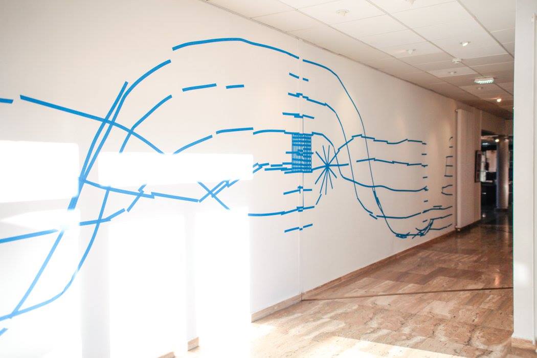
A partir de ces œuvres, elle élaborera sur les murs et les vitres de la salle d'exposition du centre culturel un dialogue entre les œuvres sélectionnées et sa pratique du dessin.
Œuvre in situ, "THE B&W PROJECT" sera la proposition d'une image hybride et éphémère correspondant à la représentation en dessin du rapport que l'artiste éprouvera avec les œuvres.
Dans la collection de l'Artothèque il y a des œuvres en couleur mais il y en a aussi beaucoup en noir et blanc. Ce projet est une belle occasion de les mettre en valeur.
"The B&W project" SLUICE art fair , London
.
The B&W Project - Instillation view at SLUICE
The B&W project poster in the middle of our special B&W co-edition made for the sluice fair , with Atelier Tchikebe, Marseille.
Lydia Rump going over the Sluice catalog designed by Daniel Devlin
Erin Lawlor and Vincent Hawkins checking out THE B&W PUBLICATION designed by studio Vincent Verdeille
see more of sluice at Sharon Butler's two coats of paint :
http://www.twocoatsofpaint.com/2015/10/this-weekend-sluice-2015.html
we showed around 30 artists from the 100 in the THE B&W PUBLICATION
Rieko koga looking at the THE B&W PUBLICATION at the opening night
The SLUICE talks program was organized by Ben Street . The art world as an open system talk. participating : Erin Lawlor, Enrico Gomez and Yifat Gat.
Marble dust on windows by y.gat
"The quintessential installation of the fair curated by Charlie Levine - Sluice director, incorporated works by Yifat Gat (who also runs the Black & White Project) and Katherine Di Turi . Using marble dust, Gat created delicate emblems in the mullioned windows of the space that ranged around three sides of a large room. Di Turi installed small, black-and-white photographs of antique mirrors on the walls between some of the windows. In each instance, what was seen within the framed pieces of glass was doubled, and still images were paired with moving. Gat’s Marble dust overlaid views of central London, bringing what was outside of the room inside. The glass protecting Di Turi’s photographs also reflected figures as they moved about, placing the space of the room within the confines of her frames. experienced that last-noted installation with only a handful of other viewers present, and we all commented on the magic of its rough simplicity. That is, of course, what distinguishes Sluice from Frieze. At the former, roughness and simplicity are contrivances that provide a whiff of “authenticity,” when Frieze truly legitimizes what money can buy or is willing to endorse. Sluice offers the possibility of art actively transforming your time with it — no money required." Janet Tyson of Hyperallergic
all photos by juliagatphotography.com
EMERGENCE , Paris , 2013.
text by Françoise Caille
Hôtel de Sauroy 58, rue Charlot 75003 - Paris. 13-27 avril 2013.
Alain Biltereyst, Amy Feldman, Andrew Seto, Claire Chesnier, Clem Crosby, Don Voisine, Erin Lawlor, Marine Pagès, Eve Ascheim, Paul Pagk, Fieroza Doorsen, Radu Tuian, Katrin Bremermann, Richard van der Aa, Kevin Monot, Sharon Butler, Michael Voss & Yifat Gat.
concept utilisé pour évoquer l’interaction de systèmes simples suffisant en nombre pour faire apparaître un certain niveau de complexité qu’il était difficile d’appréhender par l’analyse de ces systèmes pris séparément. Les territoires de l’abstraction ici présentés relèvent aussi d’une géologie particulière des systèmes. Les artistes, chacun à leur manière, utilisent comme point de départ la ligne et son lacis de convergence, presque topographique, et ainsi tracent, voire balisent, l’étendue de ses champs d’influence. Les sculpteurs, quant à eux, élargissent le principe territorial commun au groupe et fonctionnent presque comme des rhizomes.
Alain Biltereyst, Don Voisine, Michael Voss et Amy Feldman travaillent le rapport entre le fond et la forme en partant de figures simples qu’ils assemblent pour créer des structures plus complexes. Chacun à leur manière, ils défient la tension qui pourrait les rendre statiques. Biltereyst, le plus proche d’une géométrie stricte, laisse entrevoir les couches inférieures de matière et crée ainsi des vibrations de surface et une texture sensible. Voisine explore aujourd’hui la dynamique des angles afin de modifier les perceptions d’échelle et créer un champ visuel animé. Voss emboîte ou superpose des formes dont les limites imprécises trahissent le geste. Feldman déforme la rectitude et laisse place aux coulures et aux taches. Effets de matière, incision des angles, trouées dans la couleur, contours tremblés, lignes déviées... livrent l’essence d’une écriture vibrante.
Fieroza Doorsen, Yifat Gat, Eve Ascheim, Paul Pagk et Radu Tuian travaillent
un langage de constructions imprécises. Chez Doorsen et Gat, la ligne et la répétition sont des éléments dominants et construisent des univers subtils et poétiques.
Aschheim, dans ses dessins, peintures
et photogrammes, brise et démultiplie le trait, l’enveloppe de lumière, l’efface, le réduit,
le prolonge, lui insuffle un rythme musical,
le transmue en lignes urbaines ou végétales. De même, Paul Pagk et Radu Tuian,
chacun à leur manière,
tourmentent la ligne et la forme
pour tendre vers un renouvellement
constant de figures et de signes.
une couleur effacée, tout un répertoire délicat de la fragilité.
Les champs de la structure
Chesnier • Van der Aa • Pagès
Jean-Michel Alberola dit des œuvres de Claire Chesnier : « Ce n’est pas un travail d’alchimiste, mais de maçon ou de moine. Le reste lui appartient. » Précisément, son travail est tendu entre des formes massives et angulaires, où même la courbe est architecturale, et un subtil travail à l’encre où s’opère ce qu’elle nomme un « revoilement ». Liées aussi à l’architecture, les sculptures de Richard van der Aa et de Marine Pagès sont distinctes. Le premier recourt à un minimalisme de la forme. La seconde crée des ossatures abstraites et complexes, de soutien, d’emboîtement ou d’empilement. Ses dessins peuvent être perçus comme des illustrations ou des sortes de plans qui interrogent la notion de territoire.
L’idée de territoire est évoquée par Erin Lawlor. Son travail au sol d’une matière très diluée
« pose la peinture dans une position de territoire et non de fenêtre. Un territoire qu’on s’approprie [...] qui se laboure et s’élabore à la fois1. »
Le travail de ces trois artistes
porte en commun la trace de l’instrument, l’épaisseur du trait, une gestuelle contrôlée source de tension et la construction d’un espace court induit par la couleur.
Nous sommes dans « la capture de l’animé »,
qui se fige à un instant donné, mais reste éminemment vivant.
1. Erin Lawlor, Anima, Espace Mezcla, Rouen, sept-nov 2012.
Cette exposition propose d’explorer
quelques lignes, en filigrane, de l’abstraction actuelle dans sa liberté renouvelée,
où ce qui émerge du processus de création,
en peinture, en dessin comme en sculpture, relève de l’anticipation autant que de la mémoire.
Contact presse : Françoise Caille / francoisecaille@wanadoo.fr
Contact rendez-vous : Katrin Bremermann : 06 15 59 13 74
http://emergencesystem.blogspot.fr
regard sur les oeuvres de l'artothèque
Regard N°3
vernissage le 2 à 15h
à la médiathèque de Cornillon-Confoux dans le cadre des de l'artothèque
im very pleased to curate the collection of the Ouest Provence artothèque.
directed by Beatrice Bea.
here is a preview:
A conversation with artist Pete Schulte
YG: your working with graphite on paper but the result feel like 'a painting' not
like 'a drawing'. any thoughts on those categories?
PS: Honestly, categories interest me far less than the experiences conveyed by works of art. That said, drawing is undoubtedly the cornerstone of my creative practice. I do it everyday, and wherever my work my roam, conceptually, formally, or in terms of media and materials, it’s point of origin is always in some way linked to the activity that I call 'drawing'. Curiously, artists from Bonnard to Richard Serra have linked the act of drawing to thinking – an observation with which I agree – however, I will take it a step further and say that for me drawing often precedes thought. The drawings occasionally act as my guides, they provide content and direction, and eventually cognition catches up. It has also been said that drawing essentially reveals the act of its making, while painting subsequently erases it. If one were to invest in this train of thought, then it is easy to see how much of my work could fit more readily into the category of painting. Ultimately, drawing seems to be something far more direct and immediate than painting, which I suppose is the reason why I identify my work as such.
YG: I like what you said about drawing And directness, and i remember Richard sera saying a similar thing about drawing as a 'thinking mechanism'. What are you working on right now?
PS: I just finished work on a solo installation entitled, A Letter Edged In Black, at the Visual Arts Gallery at the University of Alabama at Birmingham. It represents another chapter in a series of exhibitions uniquely realized and conditioned by the sites and circumstances in which they are shown. Profoundly influenced by recent travel in Italy, the installation, comprised of painted walls, window treatment, drawings, and sculpture, immerses the viewer in a singular experience: one that intimates the surface, texture and tonality of that country’s distant past, while remaining resolutely contemporary. It is by far the largest installation that I’ve done to date and I’m very proud of the outcome. I’m also excited because the closing reception (on 22 February) will feature a live-sound installation by two incredible improvisers, Andrew Raffo Dewar – soprano sax, and Brad Davis – electronics.
YG: i identify with the strategy of presenting works within a site specific installation not evident for painters now days, its more typical to conceptual contemporary artists. but doesnt it really go back in time to previous centuries, where painters did wall works, sculptures and sometimes the architecture of the building itself?
PS: Yes, of course. Never was that more apparent to me then it was this past summer during my travels. I wonder though about the notion of specialization that is embedded in your comment. On a certain level, the core of my practice is based on making fairly conventional objects – drawings on paper. However, I certainly do not feel that these works, taken independently, or as part of installations, are devoid of conceptual content or exist outside of the realm of conceptualism. I do not identify myself as a drawer, any more than I do as an installation artist, or conceptualist. I identify myself as an artist. I think that artists are explorers at heart. I will follow a line of inquiry and pursue it wherever it may lead. Drawing is the cornerstone of my practice, but my pursuits also include an integration of painting, sculptural, time-based, social, site-specific, and curatorial activities. At the moment, I am interested less in creating ‘installations’, than I am in creating a singular, immersive experience, one that may be composed of several constituent parts, but that ultimately functions as a complete and unified whole – whatever label one wants to put on it.
YG: looking on your drawing i was admiring the way you use grey as a middle point and contra-pointing it with white and black.
i also was wondering about the way the symmetrical works holds still while the non symmetrical create movements
would you like to elaborate ?
PS: Most of my drawings are improvised and found in the act of making. Even if I’m trying to give visual form to something conceptually specific or using another drawing as a starting point (which I often do), the drawings tend to be resolved based more on feel, mood, and/or visual rhythm, rather than any sort of pre-meditated outcome. On occasion those attributes are achieved through a muted tonal range, stark contrast, or a dynamic compositional device indicative of movement, at other times a quieter and more static sensibility emerges. Whatever the case, this tendency toward improvisation is part of the adventure and enjoyment that I derive from making the drawings, or any other form that my work may embody.
YG: what artists are you currently looking at?
PS: I look at a lot of work, from the distant past to immediate contemporaries, most of which tends to come and go, but then there are those that stick, the ones who touch you profoundly and continue to hold you in their sway: James Bishop, Agnes Martin, Frederick Hammersley, Giuseppe Penone, Felix Gonzalez-Torres, Anonymous Tantric Meditation Drawings from Rajasthan (thank you Franck Andre Jamme), American Plains Indian Shields and Parfleches, Franz West, Matisse, Fra Angelico, Richard Rezac, John Dilg, Robert Ryman, Philip Guston, Blinky Palermo, David Hammons, Helio Oiticica, James Lee Byars, Anne Truitt, and Raoul de Keyser, among others.
YG: any upcoming dates you would like to mention?
PS: I’ve done five solo shows and at least another five group shows in just over a year. I’m looking forward to settling into some solid and consistent time in the studio - to simply make some work, because that is where I love to be and what I love to be doing. Eventually, I will be developing a new project for a solo show at Beta Pictoris Gallery (Birmingham, Alabama) in March of 2014. Coinciding with that exhibition, I will also be curating a group show that I am extremely excited to begin work on.
YG: anything else?
PS: Yes, thank you for taking the time talk to me about my work and projects. It’s been a pleasure.
B&W drawings from the Righteous Perpetrators @ at A.I.R. Gallery by Jennifer Wroblewski
'In conceptualizing Righteous Perpetrators, I was attracted to the cultural role of the shaman as mischief-maker or pied-piper, and the contemporary artist as proxy for the spiritual advisor in exile in an elegantly secular culture. By using the word “shaman” in conceptualizing a show about performative drawing and mark-making, I hoped to pull the discussion of drawing away from more autistic systems by which we seem bound to experience and evaluate art.'
Some institutional gravitas was lent to the project by the inclusion of four 2012 Heaven drawings by Heidi Pollard, from her ongoing series of ink grid drawings (each named Heaven, each numbered.) Ms. Pollard was the most reluctant of the group to characterize her work in relation to shamanic behavior, but I was insistent. Her repetitive mark has yielded dozens of these sublime pages, intriguingly titled Heaven, and born of the repetitive act of making straight lines.
Inger J Grytting’s work is also linear and born of repetitive mark making, specifically thousands upon thousands of graphite line segments. Like Cy Twombly turned backwards, her work mimics the behavior of writing, but eradicates the need for syntactic meaning. The making of the mark is her story. And it is a relentless one.
Jennifer Wroblewski
september 2012
other artists in the show were
Morgan O’Hara, Etty Yaniv, Yifat Gat, Paola Andrea Ochoa, Kerry Cox, Katie Cercone.
five @Galerie 1/52, Saint sur mere, France. 2012.
+ Ky Anderson + Rene Korten